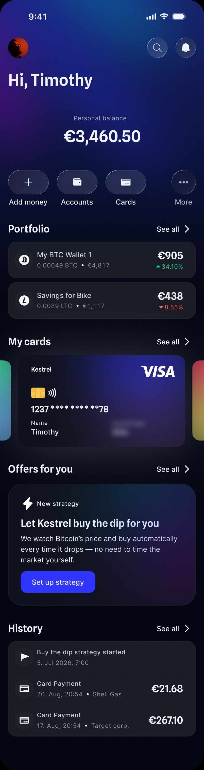
Designing a calm, automated Bitcoin investing experience.
Set three values once. When Bitcoin drops by the chosen trigger, the app buys automatically until the total cap is reached.
You set
The system handles the rest
The challenge was making inactivity feel intentional, not broken.
When Bitcoin drops, I want my app to buy automatically so I don’t have to watch the market or second-guess my timing.
The goal is confidence, not urgency.
Forecast scenarios can imply expected returns and make the feature feel more speculative.
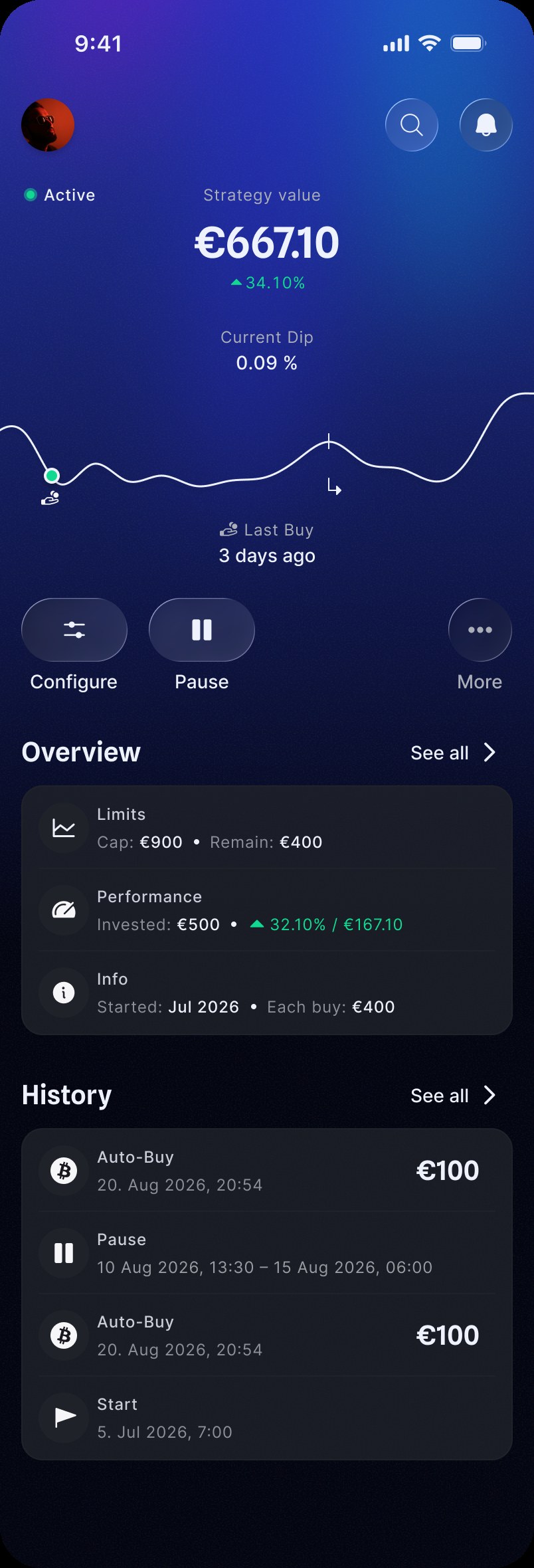
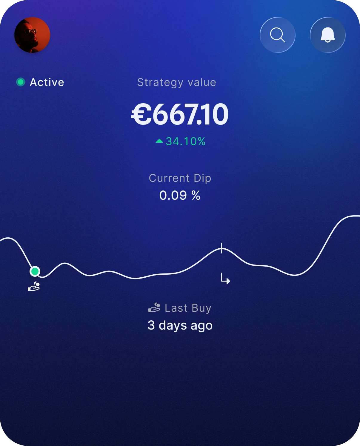
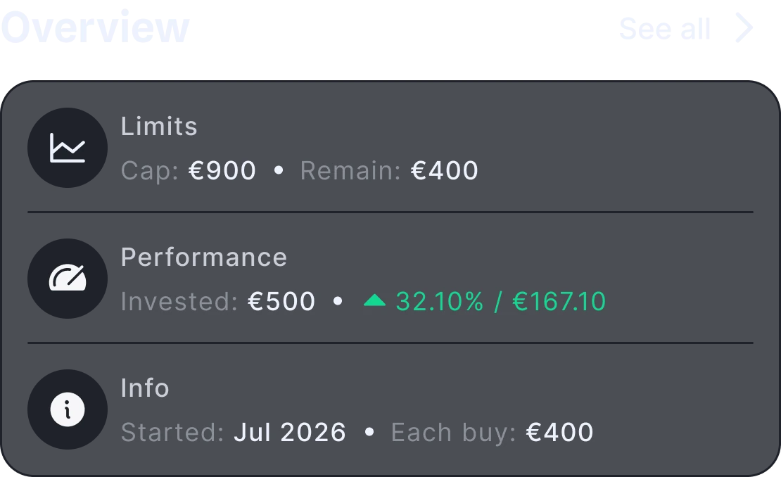
Show strategy facts only: limits, invested amount, performance and activity.
It brings back the timing decision the automation is meant to remove.
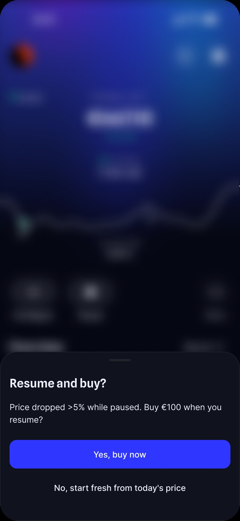
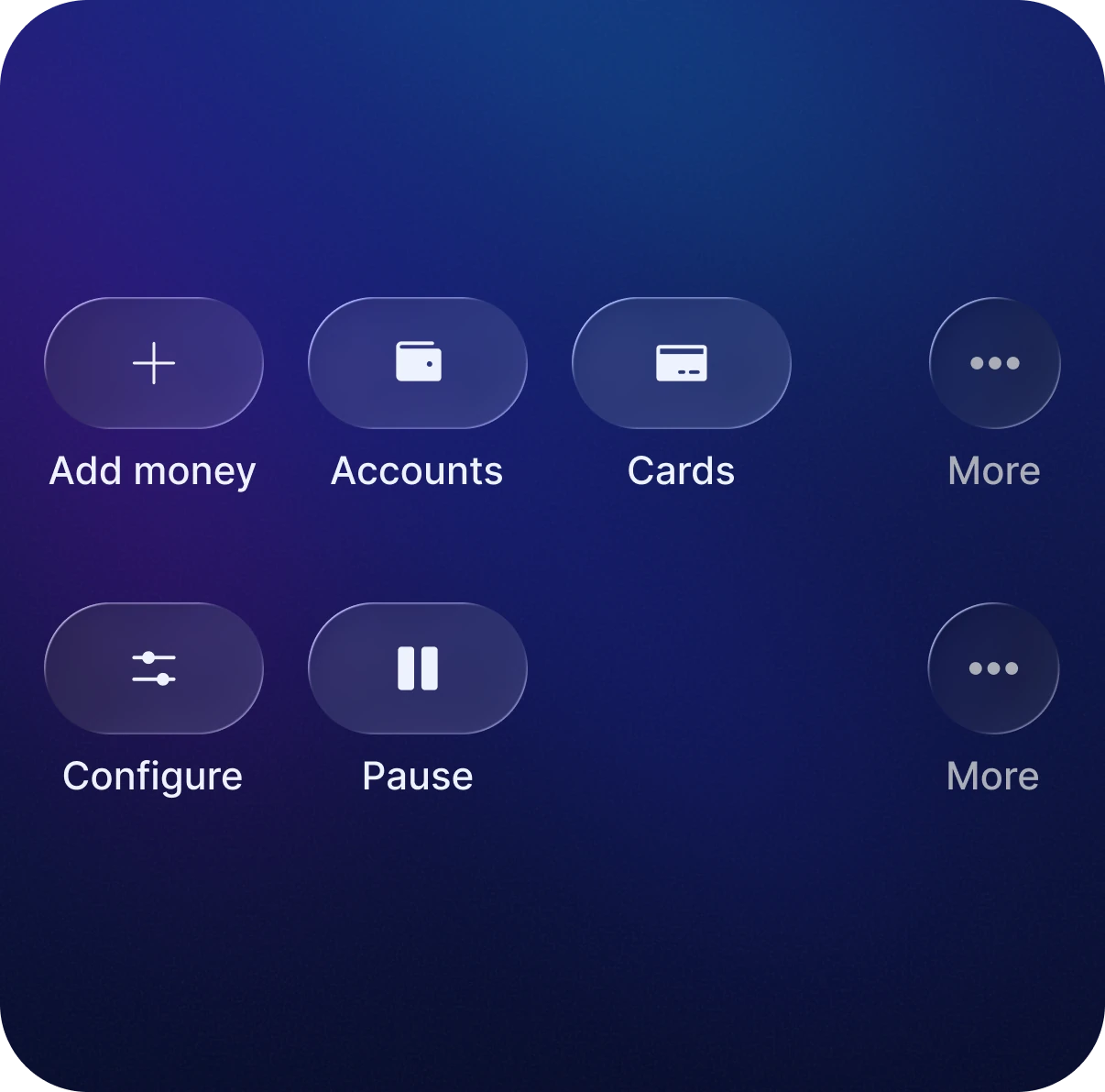
Keep the core controls to Configure, Pause and More. A manual choice appears only when resuming after a missed trigger.
A dip is the event the user is waiting for, not automatically a negative state.
Keep the chart neutral and mark completed buys separately.
Reference price resets after every buy.
A sharp drop can trigger several buys within seconds.
Summarise the burst instead of sending repeated notifications.
Buys execute at market price.
The trigger price is not the execution price.
Do not promise an exact purchase price.
Monitoring runs server-side.
The feature must work with the app closed.
Treat price monitoring as a real product capability, not just interface copy.
Insufficient balance skips the buy.
The user needs a clear explanation.
State explicitly that the next buy will be skipped.
Avoid trading-floor aesthetics and unnecessary urgency.
Financial information should scan instantly.
Brand moments should feel recognisable without competing with utility.
The brand gradient is reserved for moments such as Home and the live strategy, not everyday UI chrome.
#2132A5 → #030511Financial values use tabular numerals so live updates stay visually stable and columns remain aligned.
A small set of spacing, row and control patterns keeps the screens consistent.
Screen margin · section gap · header-to-content gap
Row height, icon badge, icon. Title plus one detail line.
Primary and control buttons share one height.
Text actions are rounded rectangles; icon controls are pills and circles.
Dot plus Micro Strong label, top-left of the live strategy.
44pt minimum. The “See all” link falls below it.
One control-row pattern works in two contexts: labelled actions, with More always last.
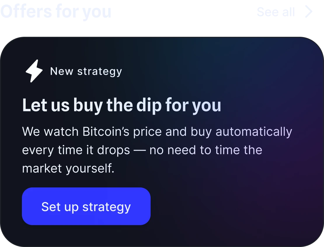
The strategy appears alongside other offers, without countdowns or urgency.
Status, value and current dip stay visible, so inactivity still reads as intentional.
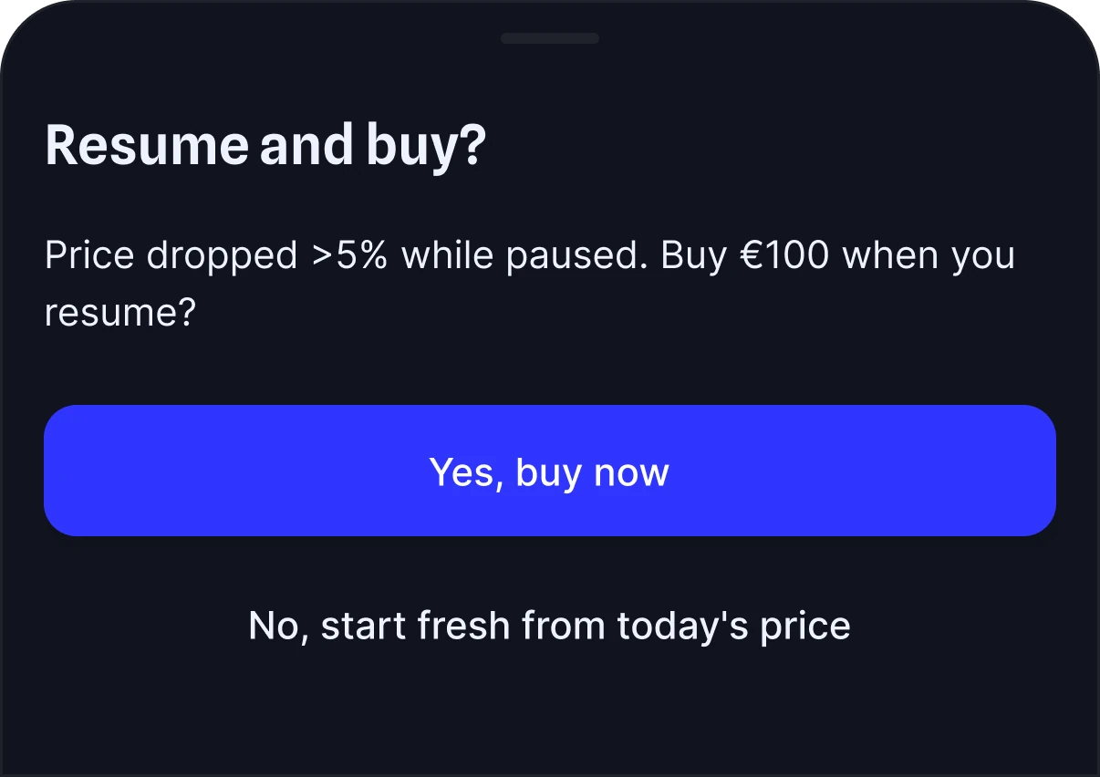
If the trigger was crossed while paused, the user can buy when resuming or reset from the current price.
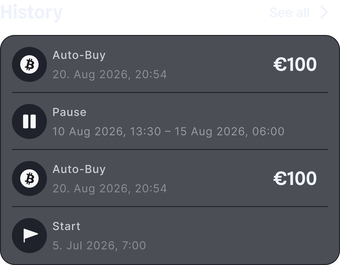
I reviewed the finished screens for contrast, interaction size and consistency, using the actual composited colours.
The surface levels sit too close together in luminance. Non-text target: 3:1.
The review pointed to shared foundations rather than isolated screens.
Text contrast was already strong. The main opportunities were clearer surface separation, consistent interaction sizes and numeric formatting.
Test whether users understand when the strategy is active, waiting, paused and triggered.
Validate investment wording and automation behaviour with a specialist.
Replay sharp market drops, repeated buys, pauses and low-balance scenarios.