Dark modeLight mode
Desktop · Mobile
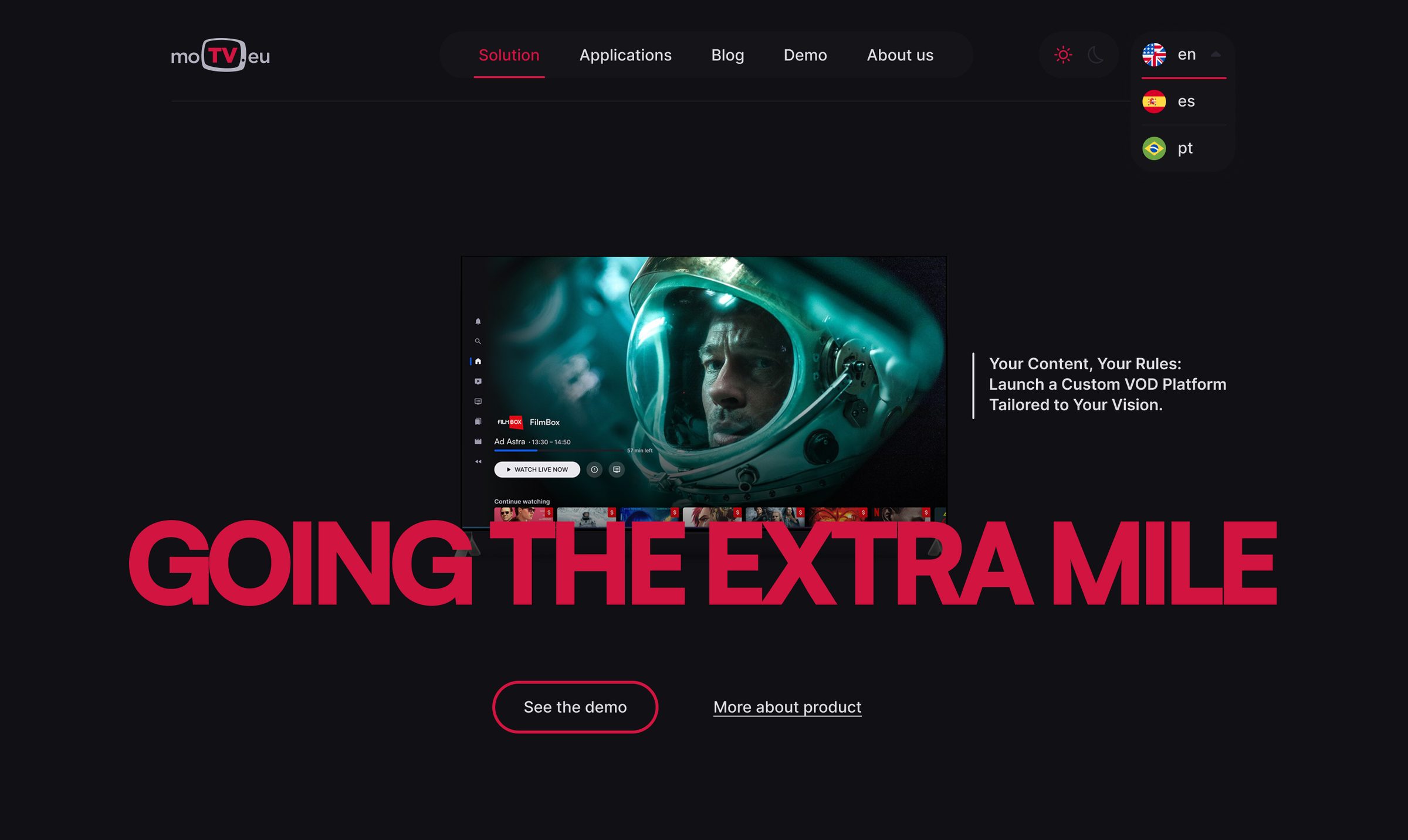
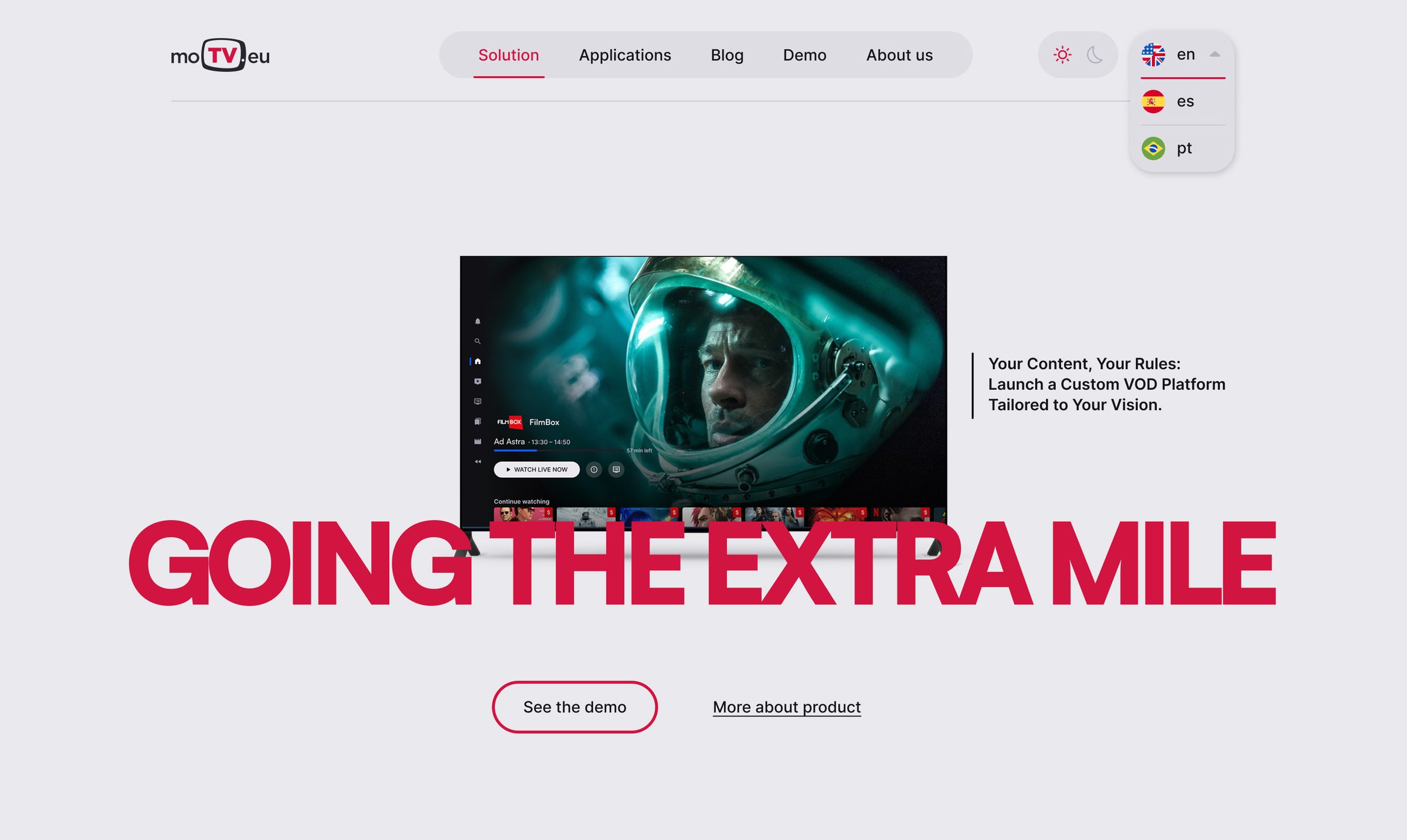
moTV.eu — whitelabel OTT / IPTV platform for PayTV operators and ISPs
The redesigned website is live at motv.eu. Switch this page between light and dark mode — the mockups follow, exactly like the real site.
moTV.eu delivers a complete whitelabel streaming platform for PayTV operators and ISPs. The product was mature. The way it presented itself was not.
I led the redesign end to end: refreshing the brand identity, building the design foundations and component library, restructuring the content for two very different audiences, and designing the new website in both dark and light mode — then supporting the team through build and launch.
moTV sells to PayTV operators and ISPs — a B2B audience where the person signing the contract and the person integrating the platform rarely share the same questions. The previous brand and website didn’t reflect the quality of the technology behind them, and a dense product was explained in a single, undifferentiated voice.
This wasn’t a website reskin. Each layer was designed to feed the next — the brand decisions became tokens, the tokens became components, and the components became pages the developers could assemble without guessing.
Reviewed the existing brand, website and sales materials, and mapped who the website really needs to convince.
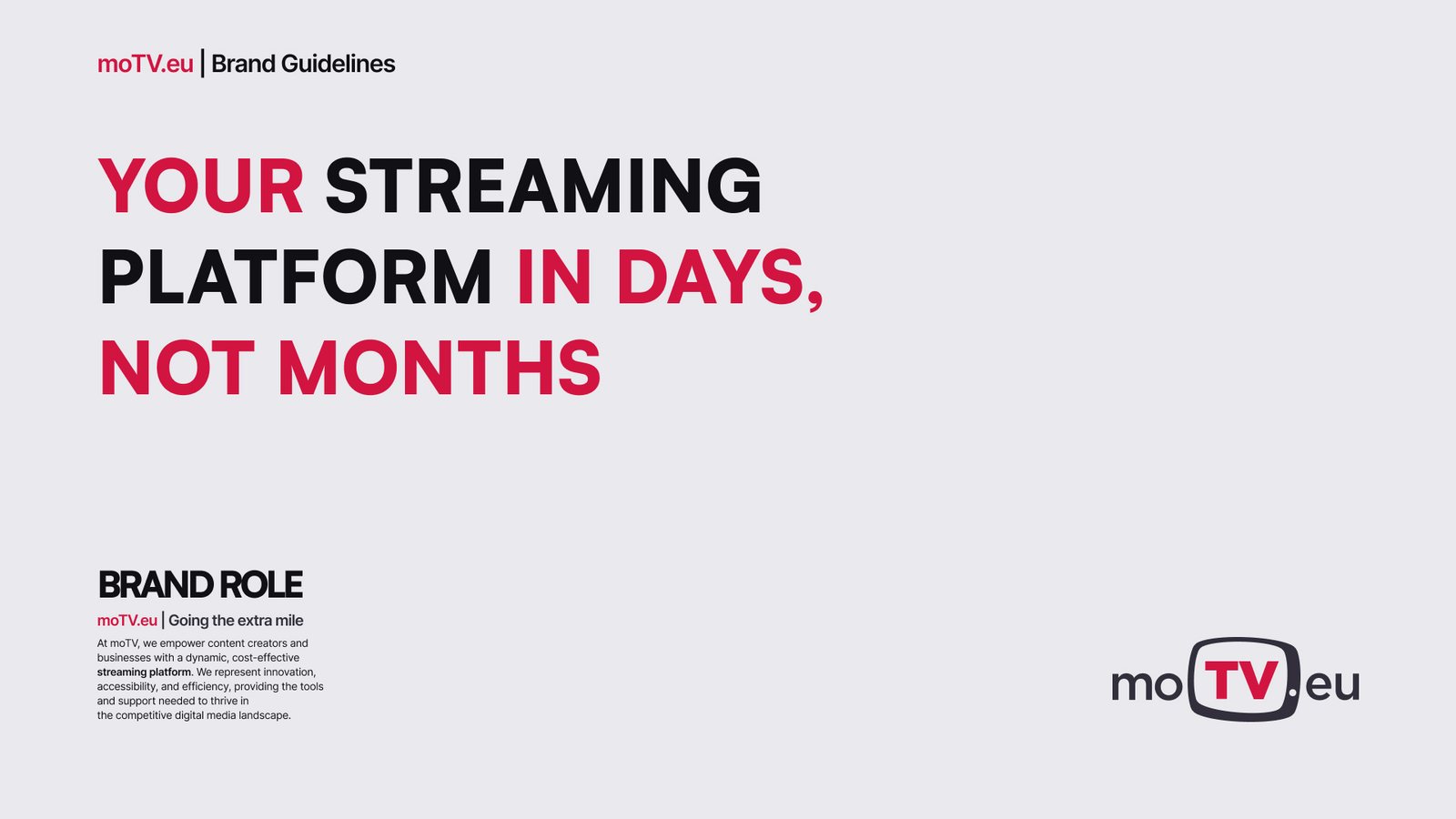
Refined the logo, rebuilt the colour system around a sharper red and set a new typographic voice. Documented it in brand guidelines.
Translated the brand into Figma variables with light and dark modes, a type scale and a spacing and layout grid.
Restructured the content around audiences — a business and a technical perspective on the same platform.
Designed every page for desktop and mobile, dark and light, from the homepage to solution, applications, about, blog and demo request.
Delivered a component library, motion references and specs, and worked alongside development through to launch.
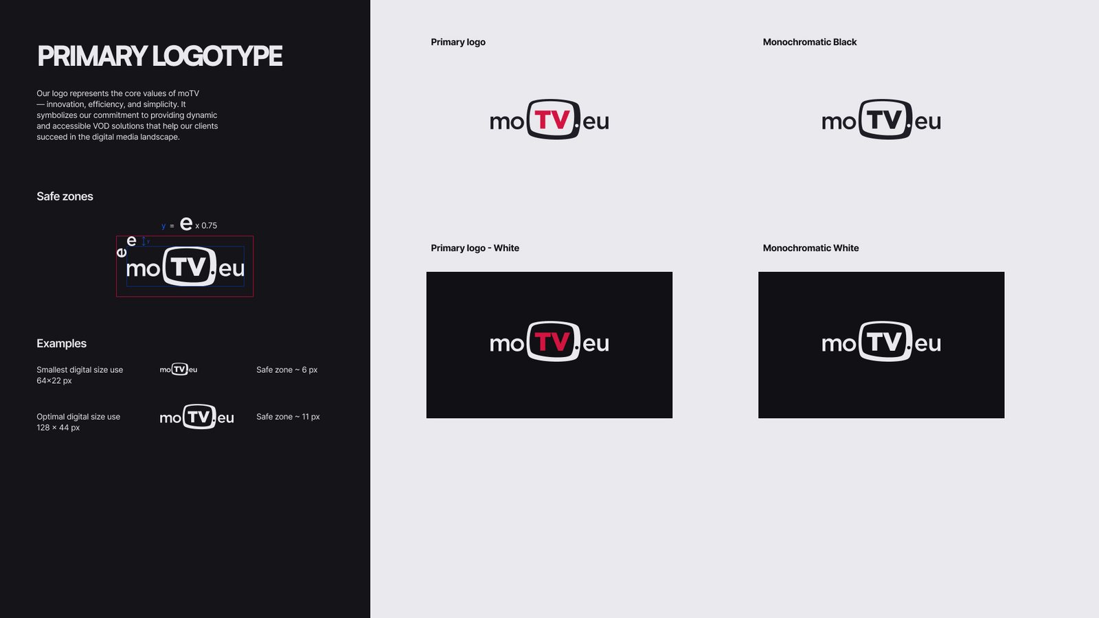
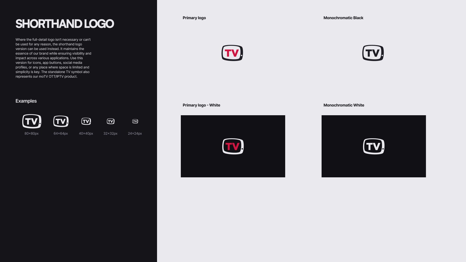
moTV already had equity in its TV-shaped mark. Throwing it away would have cost recognition with existing operators and partners. Instead, I kept the silhouette and refined the colours — a cooler ink tied to the new neutral scale and a brighter red that stays legible on dark backgrounds — then rebuilt everything around it: colour system, typography and usage rules.
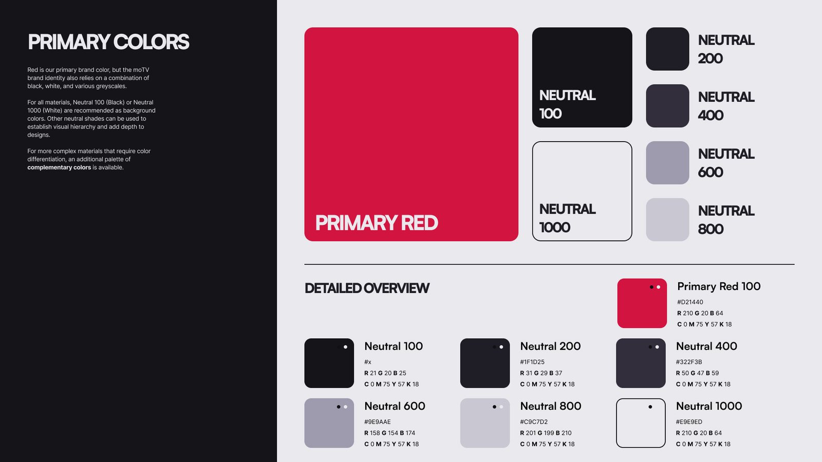
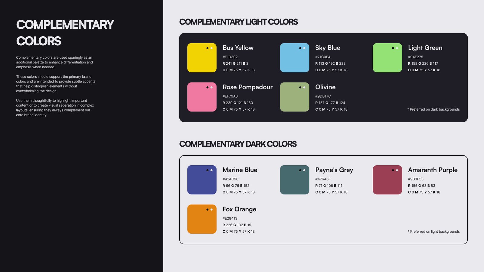
One primary red, a cool neutral scale and a set of complementary accents. Everything lives as Figma variables, and the neutral scale is where the dark mode magic happens.
Components reference roles like Neutral/1000 for backgrounds and Neutral/0 for text — never raw hex values. Switching mode swaps the values underneath, so every component supports dark mode without a second set of designs.
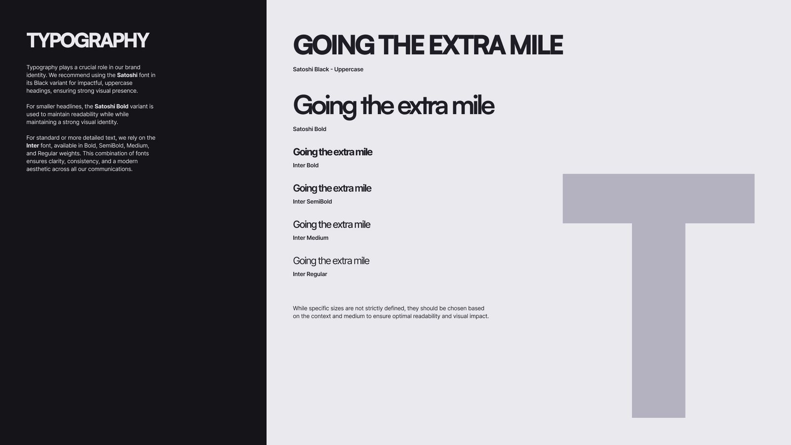
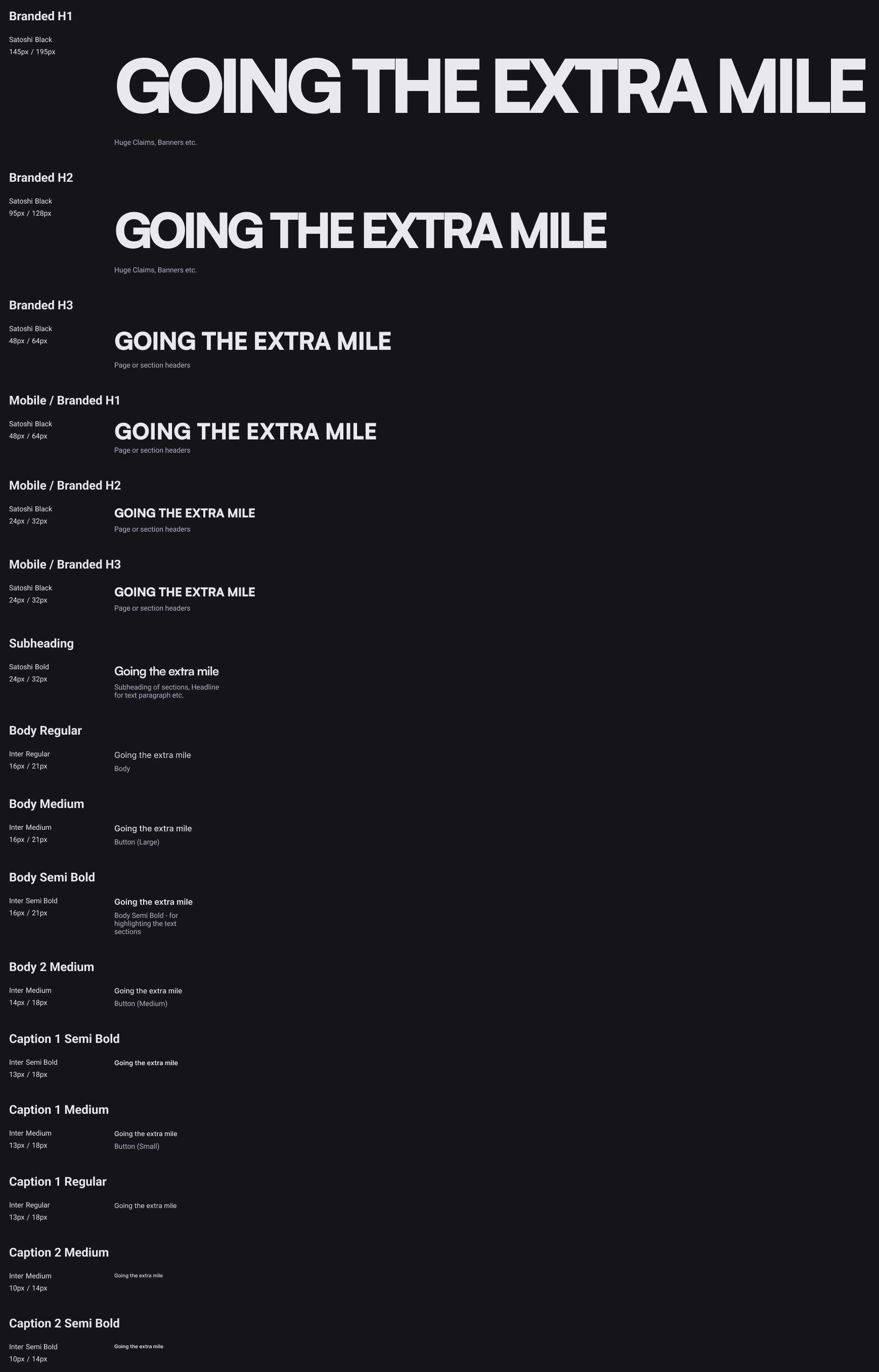
The new headline typeface is Satoshi Black set in uppercase — wide, heavy and poster-like, it gives short claims the presence of a film title. Everything else runs on Inter for clarity in long technical content, forms and UI. Two families, clearly separated roles.
Uppercase for branded claims and section headers, Bold for subheadings. Big, tight and confident.
Regular, Medium, SemiBold and Bold for body copy, buttons, captions and dense technical specs.
The decisions were packaged into a guidelines deck — logo usage, shorthand mark, primary, neutral and complementary colours, and typography — so marketing, partners and developers apply the brand the same way, without needing me in the room.
A streaming company should feel like one. The website opens in dark mode — the environment where video content looks its best — with a full-width Satoshi claim, a live product visual and a clear path to the demo.
Below the fold, the homepage works as a sales narrative: what the platform is, where it runs, how fast operators can launch, proof in numbers, and why to choose moTV.
Many visitors browse in bright offices and expect a light interface. Because every component was built on mode-aware tokens, light mode wasn’t a second design project — it was a switch. The red stays constant as the brand anchor, while neutrals mirror and imagery keeps its punch on both backgrounds.
The toggle sits in the main navigation, right next to the language selector — always one click away.
Dark
Light
From the Demo request form and the product-heavy Applications page to the story-driven About Us and the Blog, each template is assembled from the same set of components — shared navigation, section layouts, cards, forms and footer.
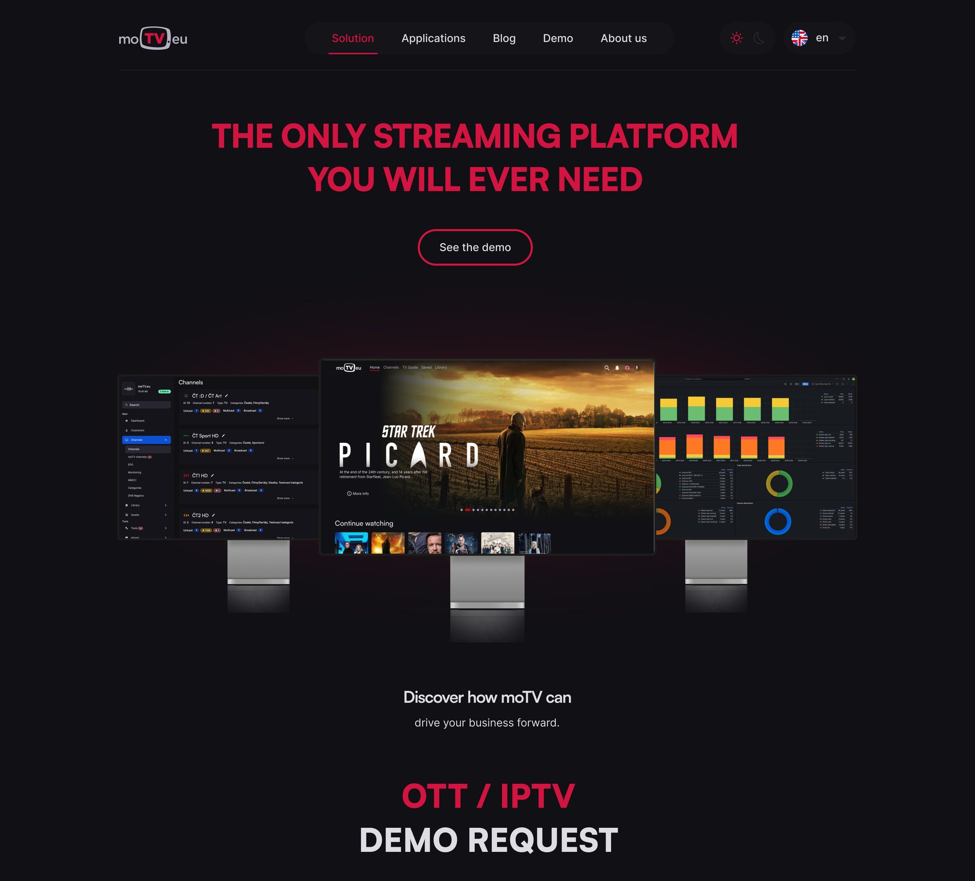
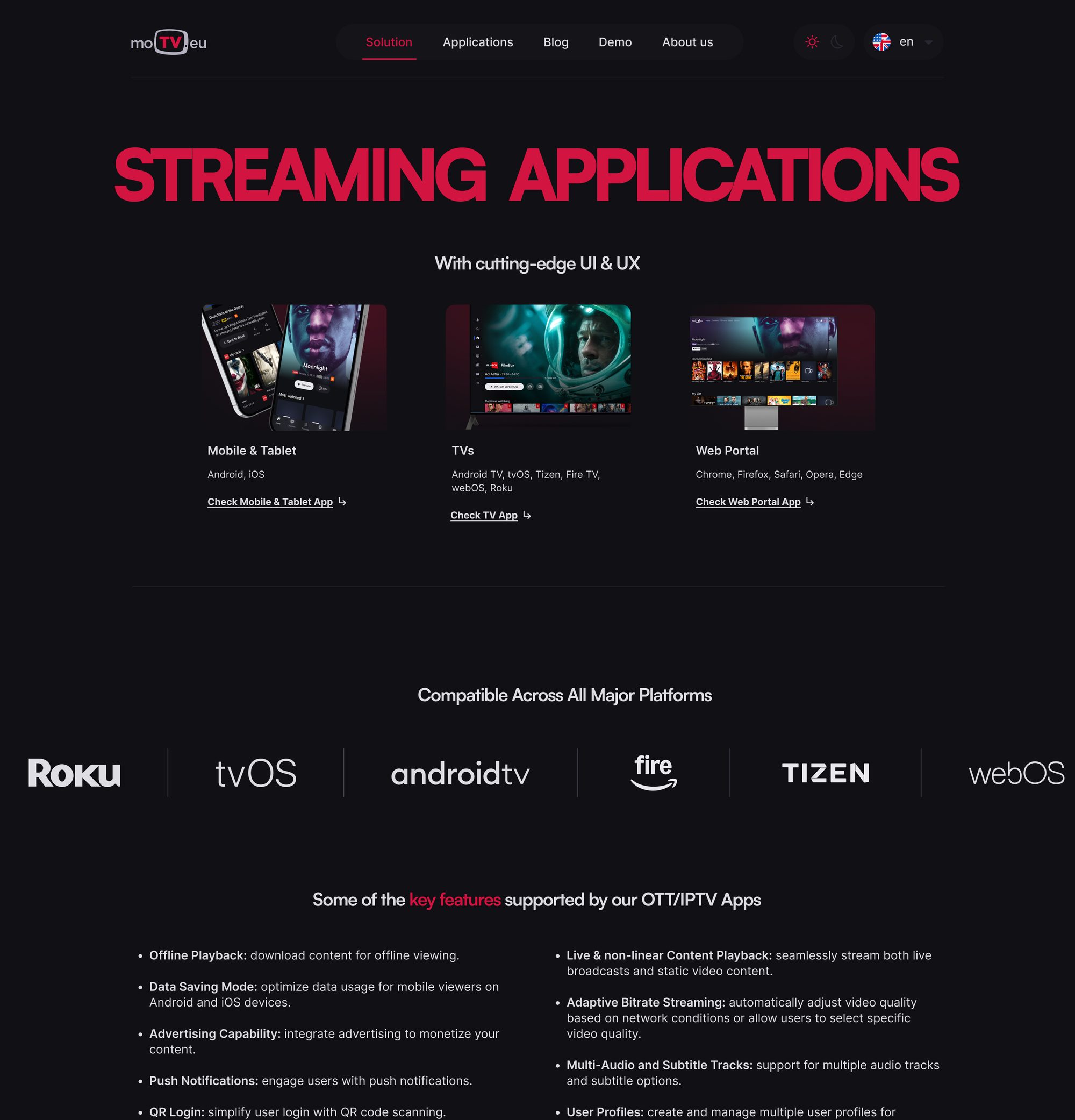
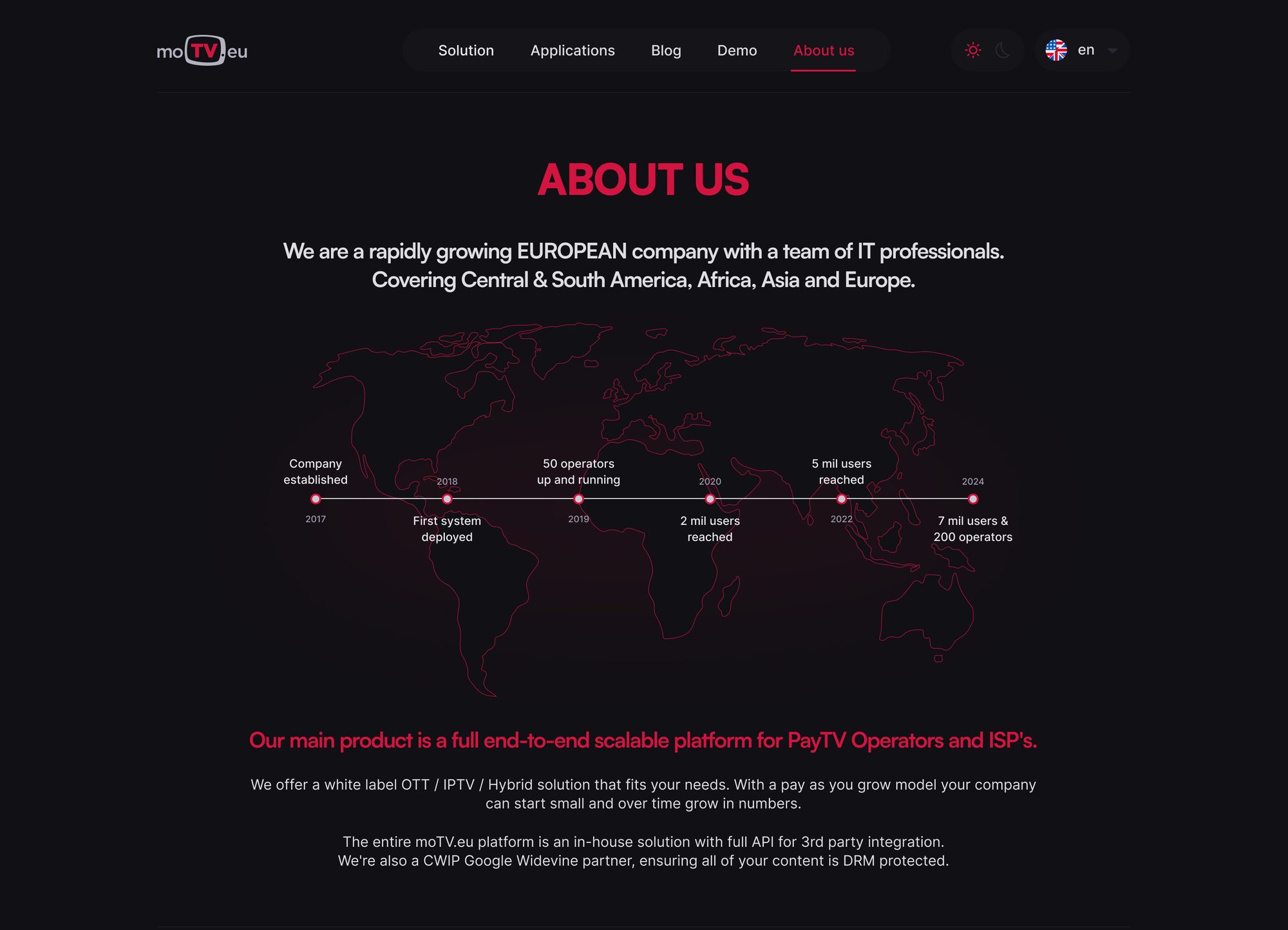
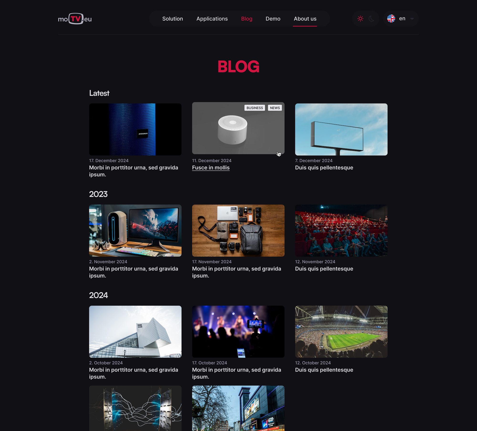
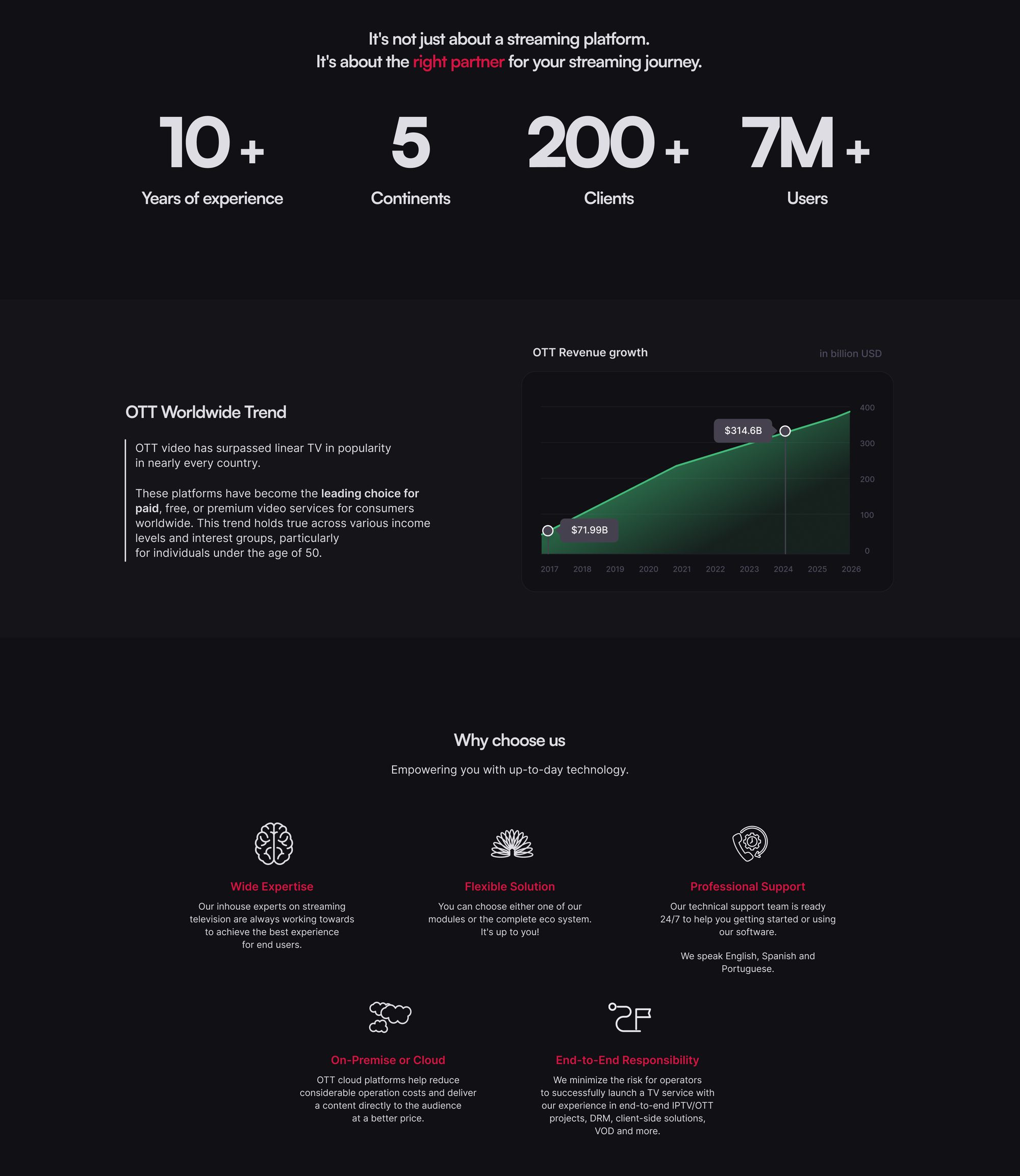
Every page has a dedicated mobile layout rather than a collapsed desktop. The branded headlines drop to a dedicated mobile scale, multi-column feature grids become swipeable rows, and navigation, language and theme switching move into a single full-screen menu.



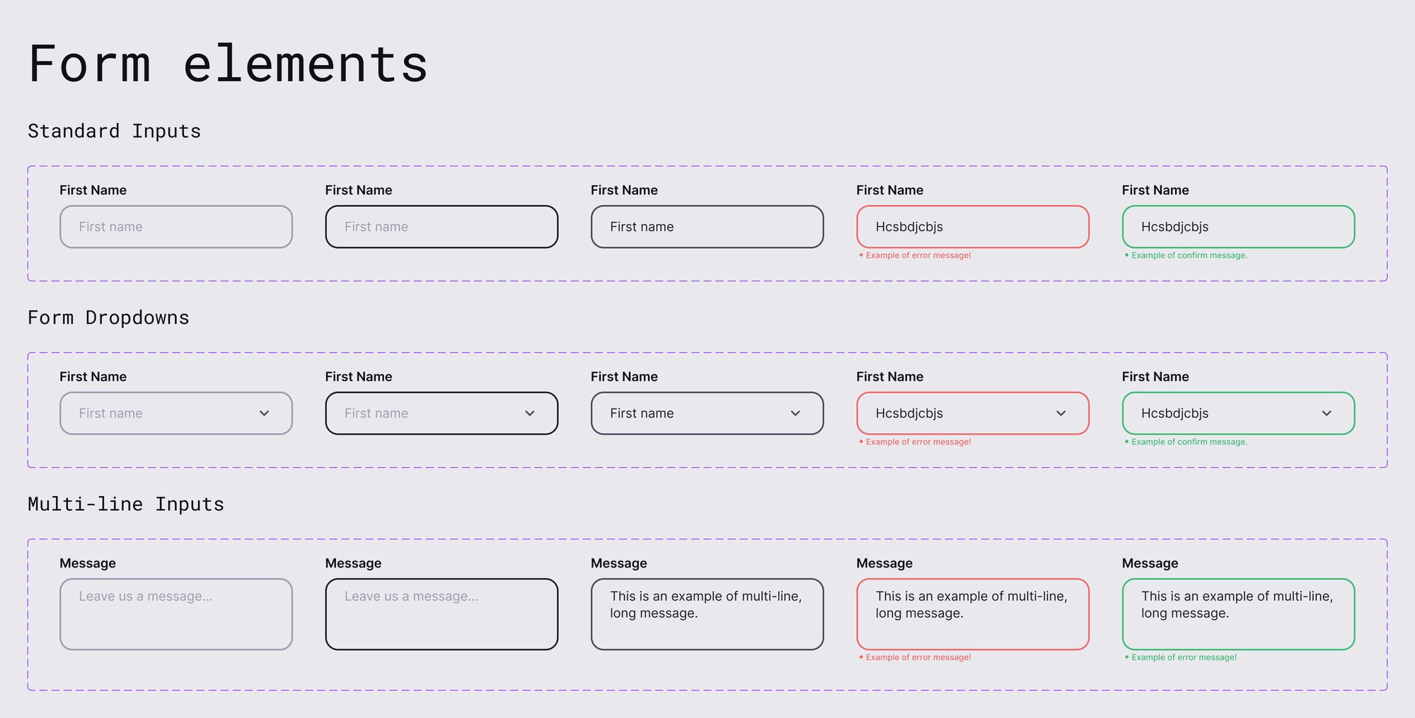
The brand and the website share one Figma library. Colour and type live as variables and styles, components are built with variants and states, and every page is composed from them — which is what made two colour modes, two breakpoints and three languages manageable for a small team.

A refreshed identity that kept its recognition, documented in guidelines anyone at moTV can follow.
Dark and light mode on every page, on desktop and mobile, with a language switch built in from day one.
Tokens, styles and components the team keeps using for new pages, newsletters, trade-show and sales materials.
Owning the whole chain — from the colour of the logo to the state of a form field — meant every decision had a downstream consequence I would feel myself. That’s the most useful constraint a designer can have: it rewards systems over one-off screens.
The project also reinforced that a rebrand is only as strong as its implementation. Guidelines, variables and components are what turned a new look into something the team can keep “going the extra mile” with.
“A brand refresh doesn’t end at the logo. It ends when the last button on the website speaks the same language.”